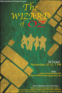
Wizard of OZ Poster
I think this project was a good learning experience for me. One of the things I learned was how to use contrast to draw peoples eyes to a certain part of the paper. I feel like I used this new skill to my advantage. I made the Oz part of The Wizard of Oz logo red to represent the ruby slippers which are an important part of the story. I also made the information and gold with white on the top to make the viewers eye go to that information.
I think the way I aligned the items in my poster was visually appealing. I decided to center align the title of the play and the outlines of the main characters. This made sense to me because the title is an important part of the story and therein characters should be front and center. I right aligned information about dates, cost, information, and playwriting credits. I did this because the center was already crowded with info and it looked out of place on the left side of the poster.
I repeated a lot of elements on my poster. I reused that gold color on the text and the image of the characters in the middle. I used the white text at the top of each section of important information. I also made sure that most of my alignment stayed consistent. Every main idea on my poster is either center or left aligned and I think that type of repetition flows in my poster.
I used proximity well on my poster project. The ideas related to the actual play are all in the same place on the right side. The characters are in the middle walking the yellow brick road. The title is at the top and center of the page above the characters. I feel like the project was an overall success an dI executed very well.


Comments
Post a Comment