Making the Pop Art Pop
In graphic design class, my peers and I were asked to create a pop art inspired design. In preparation for the project we learned about the pioneers of pop art so we studied artist like Andy Warhol and Roy Lichtenstein. After learning about the characteristics of pop art and the people who made it popular in 50s and 60s Americana, we were assigned a classmate who would serve as our subject in our pop art portrait.
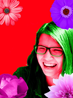
After I was assigned my subject, a girl named Avery, we went outside to the courtyard to take pictures. I took somewhere between 20 and 25 photos so I had a large pool of pictures to choose from. Initially I took a photo of Avery laughing as kind of a joke. I didn't think that I would use the picture of her laughing in my final project, but I did because I thought the picture looked natural and unplanned. To me it made the photo seem a little more genuine.
After I selected the photo I wanted, I put a dot filter on Avery and changed the color of her skin, hair, and clothes. I made her skin red and her hair and clothes green because they look good together as complementary colors. After I had Avery cut out and I made separate layers, I used the paint bucket tool to make my background red. Next, I took stock images of flowers from the internet and inserted them in my project and changed their colors to go from red to purple. I placed each of the four flowers in the the corners of the photo to serve as a nice border.


Comments
Post a Comment